Learning Activity enhancement
2022
Target Platform | Quest 2
Company | Accenture
Task | Enhance the user experience of an existing learning activity in VR based on user feedback collected from a round of testing.
Team | UX Designer, Developer
Role | UX Designer
User feedback analysis
UX Design
UI/UX Updates in Unity
Dev Tool | Unity
1. data analysis
I categorized items from a cumulative user feedback list to identify common pain points that our testers experienced.
These were the categories of issues, and the largest issue was with the interaction with the key objects.
2. major User Pain points
(1) Complex key manipulation / answer submission process (52%)
“sometimes seems you didn't select the right one, but really what you're doing wrong is the way to use the key in the wall.”
“Some of the handling required some patience and dexterity, especially getting the keys in the locks.”
(2) Difficulty with collecting keys / space navigation (13%)
“Need the ability to turn around, especially in the cafe when trying to track down all of the keys to put into the wall” – seated issue
“I didn’t know I could teleport to a different place in the room so took me a minute to understand how to get through it.”
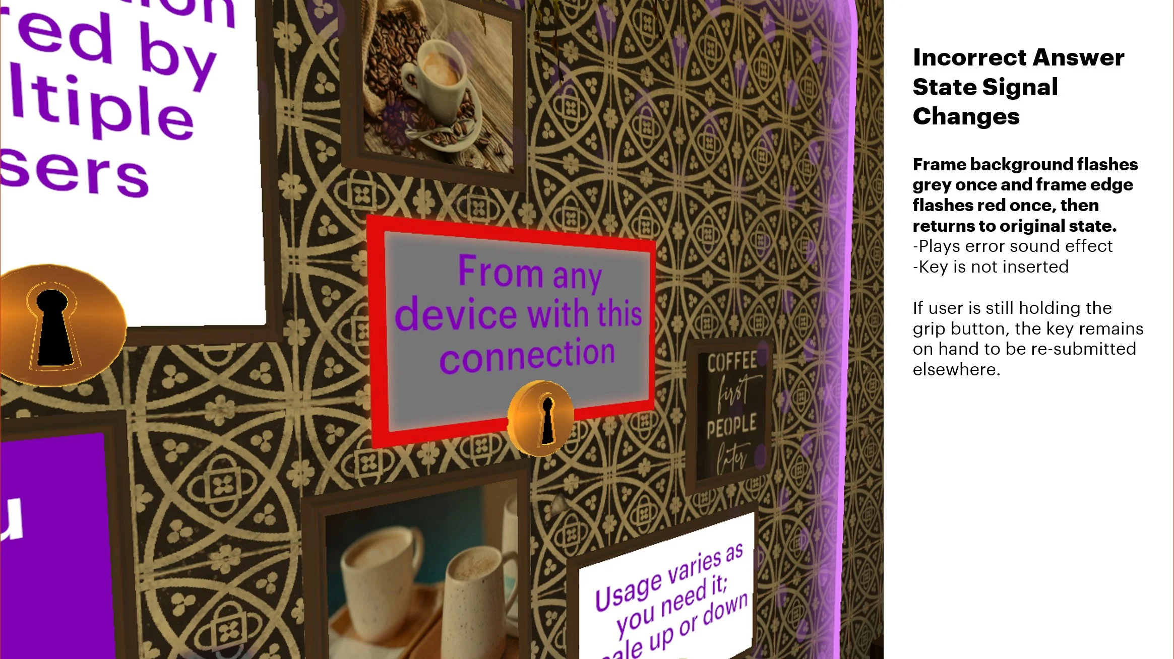
(3) Answer feedback unclear (11%)
“frustrated as keys would go into the lock and stay but they were RED, which at first I did not realize was wrong. There was not real feedback on that game to provide additional information once a key fit and turned green.”
“did not understand if the wrong answers are selected. “
3. Proposed Changes
4. enhancement Summary
1. Simplifying key interaction steps
Reduced interactions steps from 4 (grab – point - joystick push - let go) to 3 (grab - point - trigger button) with similarity to locomotion process (teleportation) and other activities.
Addressing: Complex key manipulation / answer submission process (52%)
2. Removing key collection altogether to focus on answer submission
Addressing: Difficulty with collecting keys / space navigation (13%)
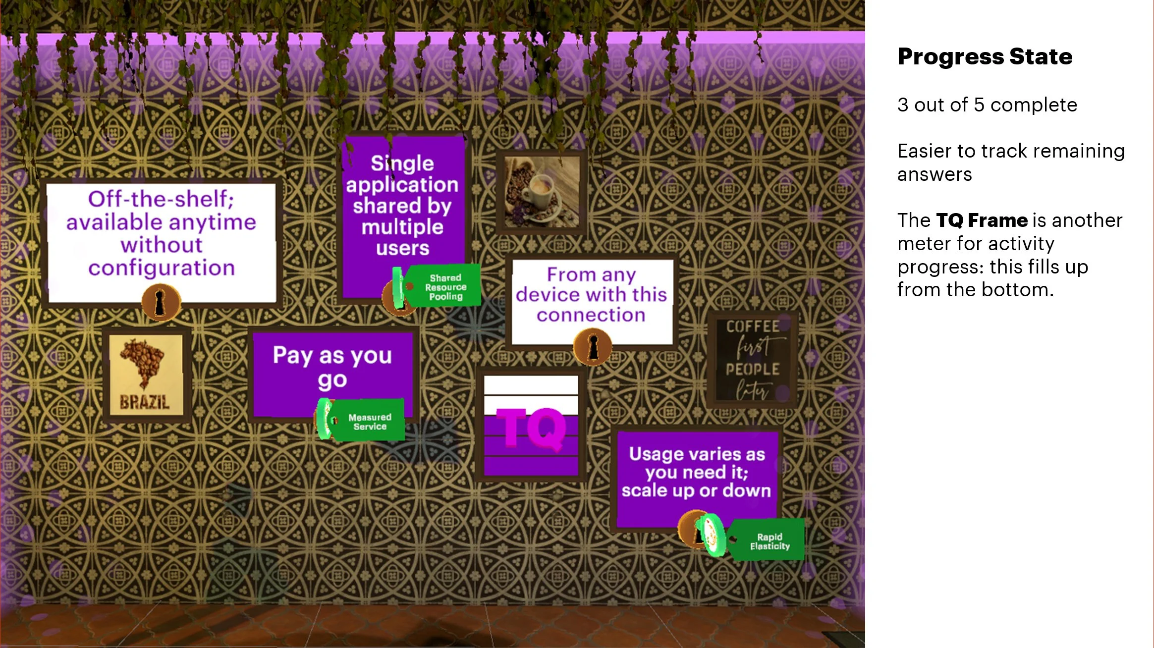
3. Adding multiple layers of feedback
This supports visual completion state tracking as well. Simplified negative feedback for wrong answers. Keys cannot be inserted to wrong answers at all. Visual/audio negative feedback is provided.
Addressing: Answer feedback unclear (11%)


